WPF 布局控件(继承自 Panel 类, 除了Border)通过测量(Measure)和排列(Arrange)两个阶段自动计算子元素的位置与尺寸,支持动态适应窗口大小变化。布局控件通过 Children 属性容纳子元素(如按钮、文本框等),支持嵌套组合实现复杂界面。
| 控件 |
布局方式 |
Grid |
网格,根据自定义行和列来设置控件的布局 |
StackPanel |
堆叠,包含的元素在垂直或水平方向排列 |
WrapPanel |
流式布局,自动换行/列 |
DockPanel |
边缘停靠+剩余填充 |
Canvas |
画布,内部元素以像素为单位绝对坐标定位 |
UniformGrid |
均分网格,相当于Grid的简化版,每个单元格的大小相同 |
Border |
装饰的控件,用于绘制边框及背景,在Border中只能有一个子控件 |
Panel基类
Panel 是 Windows Presentation Foundation(WPF)中提供布局支持的所有元素的基类。 Panel派生元素用于在可扩展应用程序标记语言(XAML)和代码中定位和排列元素。 WPF 包含一套全面的派生面板实现,可实现许多复杂布局。 这些派生类公开了启用大多数标准用户界面(UI)方案的属性和方法。 无法找到满足其需求的子排列行为的开发人员可以通过重写 ArrangeOverride 和 MeasureOverride 方法创建新的布局。
所有Panel元素都支持由FrameworkElement定义的基本大小调整和定位属性,包括Height、Width、HorizontalAlignment、VerticalAlignment和MarginLayoutTransform。 有关定位属性 FrameworkElement的其他信息,请参阅 对齐、边距和填充概述。
Panel 公开了在理解和使用布局时极为重要的附加属性。 该Background属性用于用一个Brush填充派生面板元素的边界之间的区域。 Children 表示由其 Panel 构成的元素的子集合。 InternalChildren 表示集合的内容 Children 以及数据绑定生成的成员。 两者都由父级UIElementCollection托管的子元素组成Panel。
面板还公开了一个 Panel.ZIndex 附加属性,该属性可用于在派生 Panel中实现分层顺序。 具有较高Children值的面板Panel.ZIndex集合的成员显示在值较低的Panel.ZIndex集合前面。 这对于面板特别有用,例如CanvasGrid,允许子元素共享相同的坐标空间。
Panel 还定义了 OnRender 方法,该方法可用于替代默认 Panel呈现行为。
Panel提供了GetZIndex和SetZIndex方法成员,分别表示获取某个元素的Zindex顺序和设置某个元素的ZIndex顺序。
什么是ZIndex?这是Panel提供的一个附加属性。假如一个单行单列的Grid布局控件中有两个Button,正常情况下,这两个Button都会以撑满Grid的方式星现在Grid中,那么,到底哪一个Button在上面,哪一个Button在下面呢?就看这两个Button的Panel.ZIndex附加属性的值,值越大越在上面,而值较小的那个Button将被上面的Button遮盖,从而在视觉上,用户只能看到一个Button。
Grid(网格布局)
通过行(RowDefinitions)和列(ColumnDefinitions)定义表格结构,支持单元格合并与动态尺寸调整。
关键属性:
Grid.Row / Grid.Column:指定子元素位置。RowSpan / ColumnSpan:跨行/列。ShowGridLines: 是否显示网格线- Grid的列宽与行高可采用固定、自动、按比例三种方式定义。
- 固定长度:值为一个确定的数字
- 自动长度:值为
Auto,实际作用就是取实际控件所需的最小值
- 比例长度:
*表示占用剩余的全部宽度;两行都是*,将平分剩余宽度;- 一个2
*,一个*,则前者占剩余全部宽度的2/3,后者占1/3;
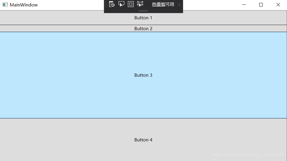
示例:
 1
 2
 3
 4
 5
 6
 7
 8
 9
10
11
12
|
<Grid>
    <Grid.RowDefinitions>   <!--设置4行-->
        <RowDefinition Height="40"></RowDefinition>
        <RowDefinition Height="Auto"></RowDefinition>
        <RowDefinition Height="2*"></RowDefinition>
        <RowDefinition Height="*"></RowDefinition>
    </Grid.RowDefinitions>
    <Button Grid.Row="0" Content="Button 1"></Button>
    <Button Grid.Row="1" Content="Button 2"></Button>
    <Button Grid.Row="2" Content="Button 3"></Button>
    <Button Grid.Row="3" Content="Button 4"></Button>
</Grid>
|
效果:
StackPanel(堆叠布局)
子元素按单一方向(Orientation="Vertical" 或 Horizontal")线性排列,不自动换行。默认方向是垂直排列(Orientation="Vertical"),子元素从上到下堆叠。如果要设置水平排列,设置 Orientation="Horizontal",子元素从左到右排列。垂直布局时,子元素宽度默认拉伸至 StackPanel 的宽度,高度由内容决定(或显式设置)。水平布局时,子元素高度拉伸至 StackPanel 高度,宽度由内容决定。
StackPanel关键属性如下:
| 属性 |
说明 |
示例值 |
Orientation |
排列方向:Vertical(默认)或 Horizontal |
Orientation="Horizontal" |
Margin |
容器外间距,控制与父容器的距离 |
Margin="10" |
Padding |
容器内边距,控制子元素与容器边界的距离 |
Padding="5" |
Background |
背景色(未设置时不响应鼠标事件) |
Background="LightGray" |
HorizontalAlignment |
容器在父容器中的水平对齐方式(Left/Center/Right/Stretch) |
HorizontalAlignment="Center" |
VerticalAlignment |
容器在父容器中的垂直对齐方式(Top/Center/Bottom/Stretch) |
VerticalAlignment="Top" |
布局嵌套
StackPanel 可嵌套其他容器(如 Grid、嵌套的 StackPanel)实现复杂结构
1
2
3
4
5
6
7
8
9
|
<!-- 垂直布局嵌套水平布局 -->
<StackPanel Orientation="Vertical">
    <TextBlock Text="用户登录"/>
    <StackPanel Orientation="Horizontal"> <!-- 水平布局 -->
        <TextBlock Text="用户名:" VerticalAlignment="Center"/>
        <TextBox Width="200"/>
    </StackPanel>
    <Button Content="提交"/>
</StackPanel>
|
滚动支持
通过 ScrollViewer 包裹 StackPanel 解决内容溢出问题
1
2
3
4
5
6
|
<ScrollViewer Height="150">
    <StackPanel>
        <Button Content="Item 1" Height="40"/>
        <!-- 更多子元素 -->
    </StackPanel>
</ScrollViewer>
|
动态操作子元素
在代码中动态添加/删除子元素
 1
 2
 3
 4
 5
 6
 7
 8
 9
10
|
// 添加按钮
private void AddButton_Click(object sender, RoutedEventArgs e) {
    Button newBtn = new Button { Content = "New Button" };
    stackPanel.Children.Add(newBtn);
}
// 删除最后一个按钮
private void RemoveButton_Click(object sender, RoutedEventArgs e) {
    if (stackPanel.Children.Count > 0)
        stackPanel.Children.RemoveAt(stackPanel.Children.Count - 1);
}
|
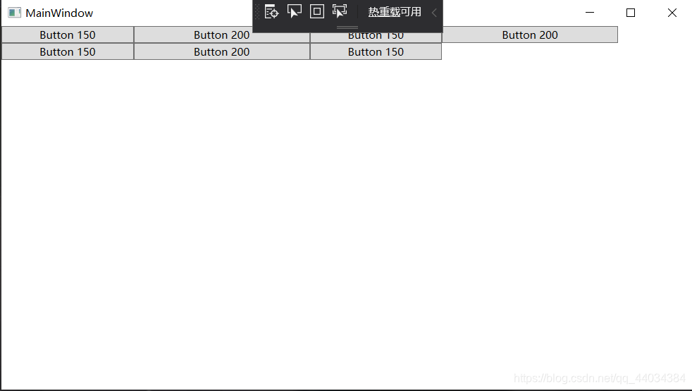
WrapPanel(流式布局)
WrapPanel与StackPanel类似的功能, 相对于WrapPanel , 具有在有限的容器范围内, 可以自动换行, 或者换列处理。
具体则取决于WrapPanel的排列方式 (Orientation):
Orientation="Horizontal"时各控件从左至右排列,当面板长度不够时,子控件就会自动换行,继续按照从左至右的顺序排列Orientation="Vertical"时各控件从上至下排列,当面板高度不够时,子控件就会自动换列,继续按照从上至下的顺序排列
示例:
1
2
3
4
5
6
7
8
9
|
<WrapPanel Orientation="Horizontal">
    <Button Content="Button 150" Width="150"></Button>
    <Button Content="Button 200" Width="200"></Button>
    <Button Content="Button 150" Width="150"></Button>
    <Button Content="Button 200" Width="200"></Button>
    <Button Content="Button 150" Width="150"></Button>
    <Button Content="Button 200" Width="200"></Button>
    <Button Content="Button 150" Width="150"></Button>
</WrapPanel>
|
效果:
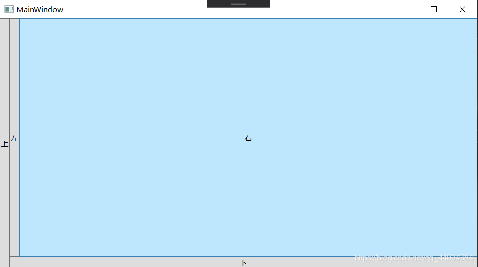
DockPanel(停靠布局)
DockPanel支持让元素简单地停靠在整个面板的某一条边上,然后拉伸元素以填满全部宽度或高度。它也支持让一个元素填充其他已停靠元素没有占用的剩余空间。
- 包含在DockPanel中的元素, 具备
DockPanel.Dock的4个枚举值 (Top/Left/Right/Bottom) 用于设置元素的锚定位置
LastChildFill : 容器中的最后一个元素时, 默认该元素填充DockPanel所有空间, 默认值为TrueDockPanel中的元素未显示添加DockPanel.Dock属性时, 系统则会默认为 DockPanel.Dock=“Left”
示例:
1
2
3
4
5
6
|
<DockPanel>
    <Button Content="上" DockPanel.Dock="Left"></Button>
    <Button Content="下" DockPanel.Dock="Bottom"></Button>
    <Button Content="左" DockPanel.Dock="Left"></Button>
    <Button Content="右" DockPanel.Dock="Right"></Button>
</DockPanel>
|
效果:
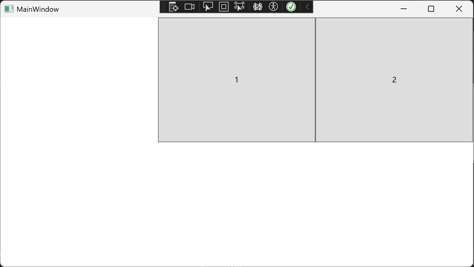
UniformGrid就是Grid的简化版,每个单元格的大小相同,不需要定义行列集合。每个单元格始终具有相同的大小,每个单元格只能容纳一个控件。UniformGrid控件提供了3个属性,分别是Firstcolumn、Columns、Rows。FirstColumn表示第一行要空几个单元格,后面两个属性分别用于设置行数和列数。
- 与Grid不同的是, 该容器具备
Columns/Rows属性, 通过设置该属性, UniformGrid则具备相应的行与列, 但是设置的Columns/Rows不允许单独的进行容器的大小设置
- 位于
UniformGrid中的子元素, 按输入顺序排列至容器中, 直至填充容器的所有空间
- 未显示指定
Columns/Rows, UniformGrid则为子元素动态分配Columns/Rows, 换行与换列的基准主要基于UniformGrid的容器大小( 宽度与高度)
示例:
1
2
3
4
5
|
<UniformGrid Rows="2" Columns="3" FirstColumn="1">
    <Button Content="1"/>
    <Button Content="2"/>
    <!-- 2行3列等分 -->
</UniformGrid>
|
效果:
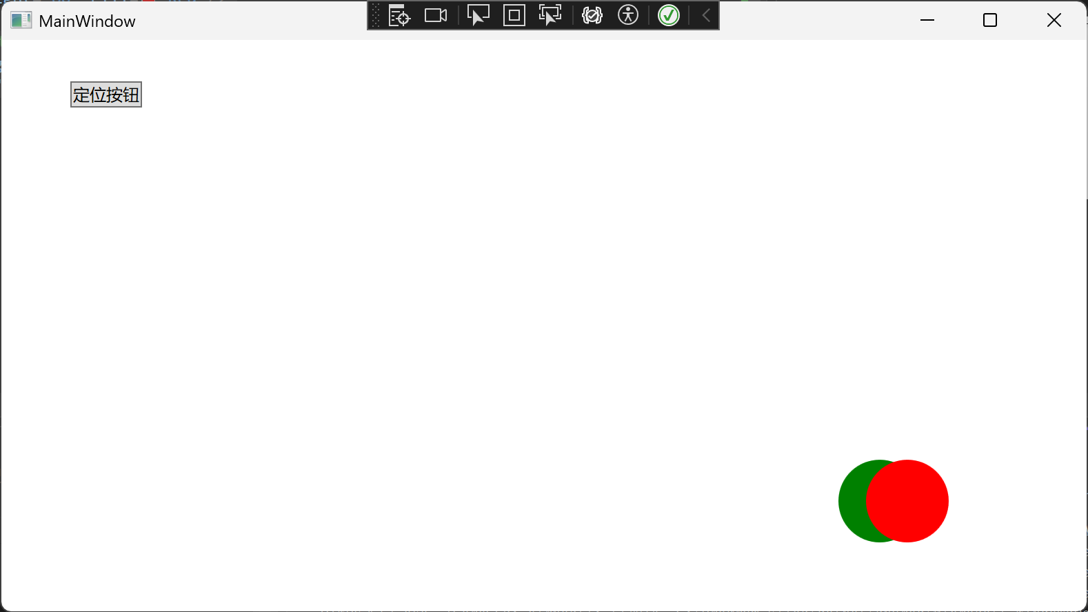
Canvas(画布)
Canvas是一个类似于坐标系的面板,所有的元素通过设置坐标来决定其在坐标系中的位置。
基于左上角原点(0,0)的笛卡尔坐标系,通过附加属性控制位置,使用使用 Canvas.ZIndex 控制叠放次序(默认值为0,值越大显示在越上层)。
定位属性有四个:
| 属性 |
值类型 |
说明 |
Canvas.Left |
double |
元素左边缘与画布左边缘的距离 |
Canvas.Top |
double |
元素顶部与画布顶部的距离 |
Canvas.Right |
double |
元素右边缘与画布右边缘的距离 |
Canvas.Bottom |
double |
元素底部与画布底部的距离 |
 1
 2
 3
 4
 5
 6
 7
 8
 9
10
11
12
13
|
    <Canvas>
        <!-- 使用Left和Top定位 -->
        <Button Canvas.Left="50" Canvas.Top="30" Content="定位按钮"/>

        <!-- 使用Right和Bottom定位 -->
        <Ellipse Canvas.Right="100" Canvas.Bottom="50"
             Width="60" Height="60" Fill="Red"/>

        <!-- 使用Right和Bottom定位 -->
        <Ellipse Canvas.Right="120" Canvas.Bottom="50" Canvas.ZIndex="-10"
     Width="60" Height="60" Fill="Green"/>
    </Canvas>
|
效果:
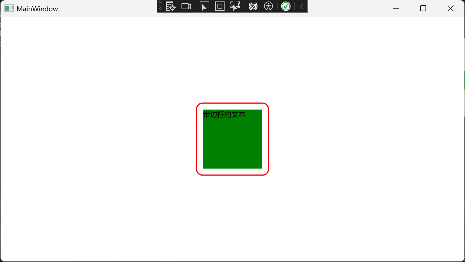
Border(边框)
Border是WPF中最常用的装饰性容器控件,用于为其他元素提供视觉框架。它不包含复杂布局逻辑,而是专注于为单个子元素添加装饰效果。提供边框、背景、圆角等视觉效果,没有复杂的布局计算,性能高效。
边框属性
| 属性 |
类型 |
说明 |
示例 |
BorderBrush |
Brush |
边框颜色 |
BorderBrush="Blue" |
BorderThickness |
Thickness |
边框粗细 |
BorderThickness="2" (四边相同) BorderThickness="1,2,3,4" (左,上,右,下) |
CornerRadius |
CornerRadius |
圆角半径 |
CornerRadius="10" (四角相同) CornerRadius="5,10,15,20" (左上,右上,右下,左下) |
背景属性
| 属性 |
说明 |
高级用法 |
Background |
背景色 |
支持渐变: <LinearGradientBrush>...</LinearGradientBrush> |
Padding |
内边距 |
Padding="10" (四边相同) Padding="5,10,15,20" (左,上,右,下) |
高级渲染属性
| 属性 |
说明 |
Effect |
添加视觉效果(如阴影) |
OpacityMask |
透明度蒙版 |
RenderTransform |
渲染变换 |
实现基本边框和圆角
1
2
3
4
5
|
<Grid HorizontalAlignment="Center" VerticalAlignment="Center">
    <Border BorderBrush="Red" BorderThickness="2" Padding="10" CornerRadius="10">
        <TextBlock Text="带边框的文本" Width="100" Height="100" Background="Green"/>
    </Border>
</Grid>
|
效果
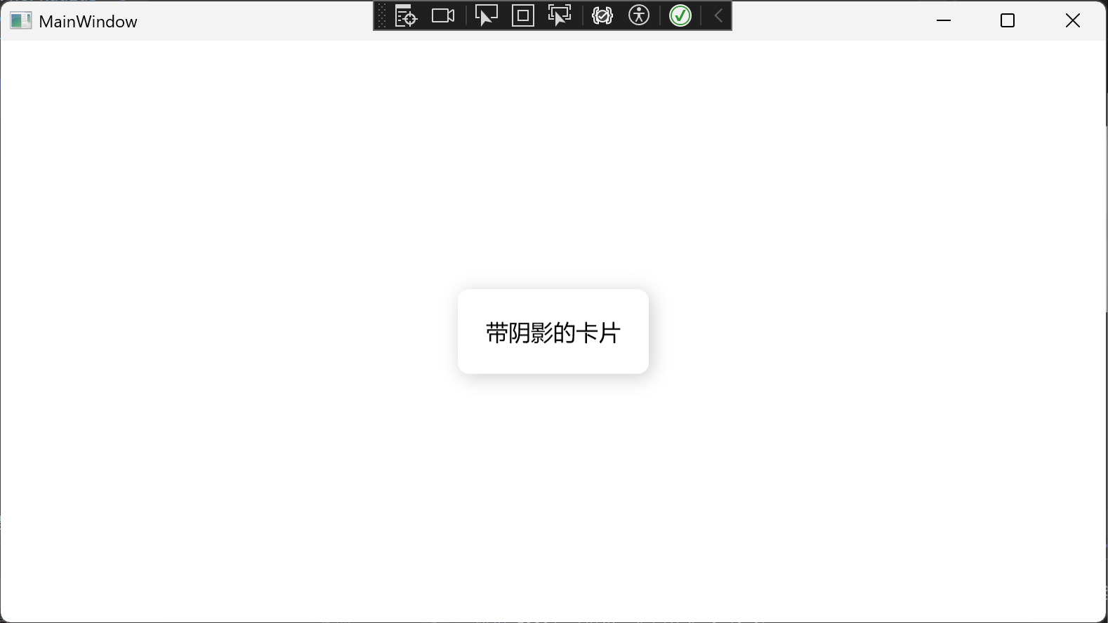
实现阴影效果
 1
 2
 3
 4
 5
 6
 7
 8
 9
10
11
12
13
14
15
16
|
<!-- 在资源中定义阴影 -->
<Window.Resources>
    <DropShadowEffect x:Key="CommonShadow"
                  BlurRadius="20"
                  ShadowDepth="3"
                  Opacity="0.2"/>
</Window.Resources>

<Grid HorizontalAlignment="Center" VerticalAlignment="Center">
    <Border Background="White"
    CornerRadius="8"
    Padding="20"
    Effect="{StaticResource CommonShadow}">
        <TextBlock Text="带阴影的卡片" FontSize="16"/>
    </Border>
</Grid>
|
效果
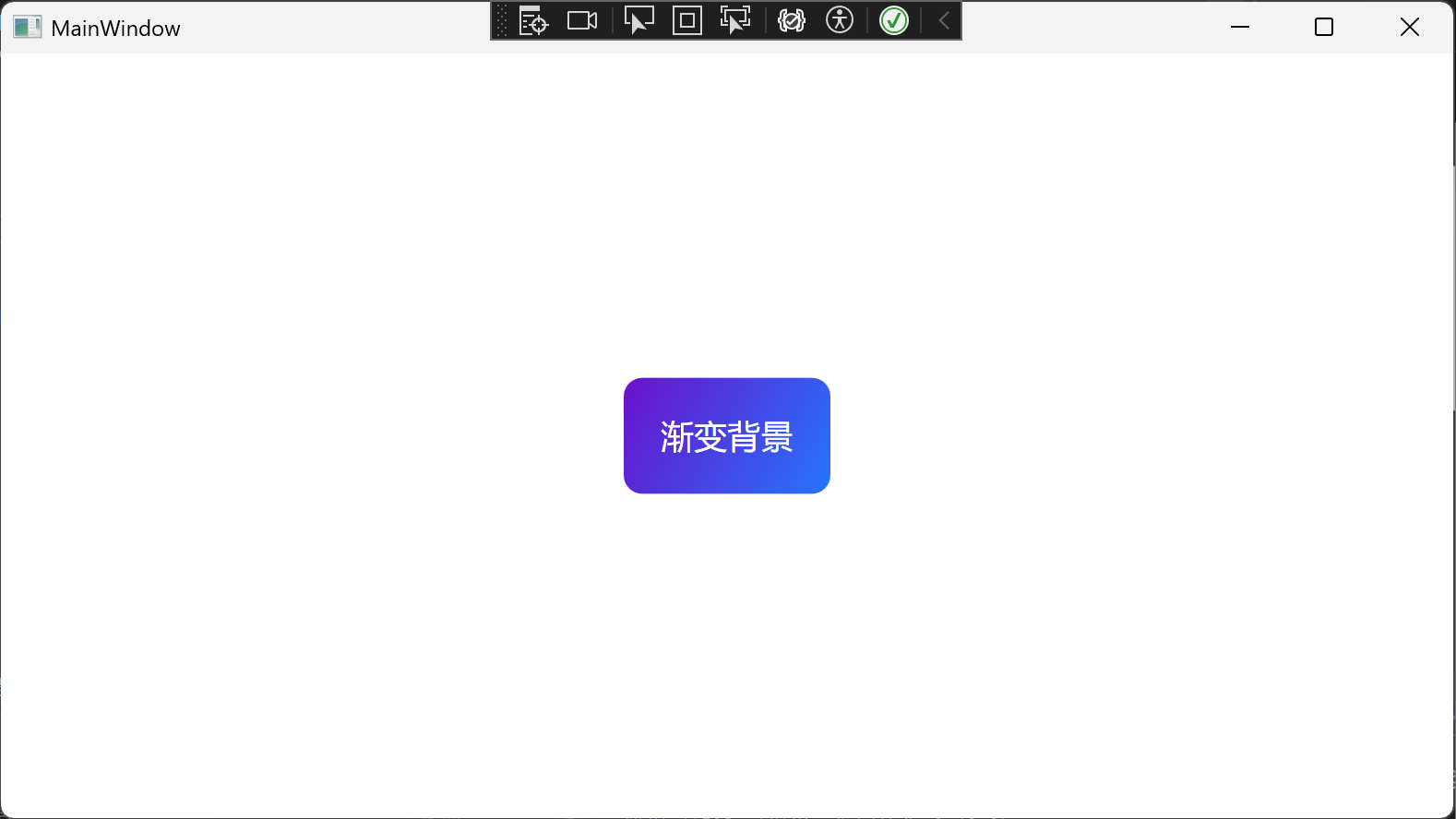
设置渐变背景
 1
 2
 3
 4
 5
 6
 7
 8
 9
10
|
<Border CornerRadius="10" Padding="20">
    <Border.Background>
        <LinearGradientBrush StartPoint="0,0" EndPoint="1,1">
            <GradientStop Color="#FF6A11CB" Offset="0.0"/>
            <GradientStop Color="#FF2575FC" Offset="1.0"/>
        </LinearGradientBrush>
    </Border.Background>

    <TextBlock Text="渐变背景" Foreground="White" FontSize="18"/>
</Border>
|
效果
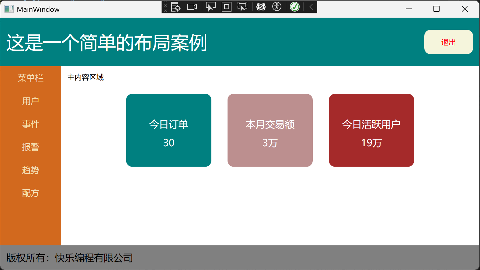
简单案例
 1
 2
 3
 4
 5
 6
 7
 8
 9
10
11
12
13
14
15
16
17
18
19
20
21
22
23
24
25
26
27
28
29
30
31
32
33
34
35
36
37
38
39
40
41
42
43
44
45
46
47
48
49
50
51
52
53
54
55
56
57
58
59
60
61
62
63
64
65
66
67
68
69
70
71
72
73
74
75
76
77
78
79
80
81
82
83
84
85
86
|
<Window x:Class="_01WPF入门.MainWindow"
        xmlns="http://schemas.microsoft.com/winfx/2006/xaml/presentation"
        xmlns:x="http://schemas.microsoft.com/winfx/2006/xaml"
        xmlns:d="http://schemas.microsoft.com/expression/blend/2008"
        xmlns:mc="http://schemas.openxmlformats.org/markup-compatibility/2006"
        xmlns:local="clr-namespace:_01WPF入门"
        mc:Ignorable="d"
        WindowStartupLocation="CenterScreen"
        Title="MainWindow" Height="450" Width="800">

    <DockPanel>
        <Grid DockPanel.Dock="Top" Background="Teal" Height="80">
            <Grid.ColumnDefinitions>
                <ColumnDefinition Width="*"/>
                <ColumnDefinition Width="*"/>
            </Grid.ColumnDefinitions>
            <TextBlock Grid.Column="0" Text="这是一个简单的布局案例"  Margin="10,0,0,0" VerticalAlignment="Center" FontSize="30" Foreground="White"/>
            <Border Margin="0,0,10,0" HorizontalAlignment="Right" Grid.Column="1" Height="40" Width="80" CornerRadius="10" Background="Beige">
                <TextBlock Text="退出" Foreground="Red" VerticalAlignment="Center" HorizontalAlignment="Center"/>
            </Border>
        </Grid>

        <StackPanel DockPanel.Dock="Bottom" Background="Gray" Height="40" Orientation="Horizontal">
            <TextBlock Margin="10, 0,0,0" Text="版权所有:快乐编程有限公司" VerticalAlignment="Center" Foreground="Black" FontSize="16"/>
        </StackPanel>

        <StackPanel DockPanel.Dock="Left" Background="Chocolate" Width="100">
            <TextBlock Margin="0, 10" FontSize="14" Text="菜单栏" HorizontalAlignment="Center" Foreground="Wheat"/>
            <TextBlock Margin="0, 10" FontSize="14" Text="用户" HorizontalAlignment="Center" Foreground="Wheat"/>
            <TextBlock Margin="0, 10" FontSize="14" Text="事件" HorizontalAlignment="Center" Foreground="Wheat"/>
            <TextBlock Margin="0, 10" FontSize="14" Text="报警" HorizontalAlignment="Center" Foreground="Wheat"/>
            <TextBlock Margin="0, 10" FontSize="14" Text="趋势" HorizontalAlignment="Center" Foreground="Wheat"/>
            <TextBlock Margin="0, 10" FontSize="14" Text="配方" HorizontalAlignment="Center" Foreground="Wheat"/>
        </StackPanel>


        <StackPanel>
            <TextBlock Text="主内容区域" Margin="10, 10, 0, 20"/>
            <UniformGrid Columns="3" Width="500" Height="120">
                <Border Width="140" CornerRadius="10" Background="Teal">
                    <StackPanel VerticalAlignment="Center">
                        <TextBlock Text="今日订单"
                                   FontSize="16"
                                   HorizontalAlignment="Center"
                                   Margin="0, 10, 0, 0"
                                   Foreground="White"/>
                        <TextBlock Text="30"
                           FontSize="16"
                           HorizontalAlignment="Center"
                           Margin="0, 10, 0, 0"
                           Foreground="White"/>
                    </StackPanel>
                </Border>
                <Border Width="140" CornerRadius="10" Background="RosyBrown">
                    <StackPanel VerticalAlignment="Center">
                        <TextBlock Text="本月交易额"
                           FontSize="16"
                           HorizontalAlignment="Center"
                           Margin="0, 10, 0, 0"
                           Foreground="White"/>
                        <TextBlock Text="3万"
                            FontSize="16"
                            HorizontalAlignment="Center"
                            Margin="0, 10, 0, 0"
                            Foreground="White"/>
                    </StackPanel>
                </Border>
                <Border Width="140" CornerRadius="10" Background="Brown">
                    <StackPanel VerticalAlignment="Center">
                        <TextBlock Text="今日活跃用户"
                               FontSize="16"
                               HorizontalAlignment="Center"
                               Margin="0, 10, 0, 0"
                               Foreground="White"/>
                        <TextBlock Text="19万"
                                FontSize="16"
                                HorizontalAlignment="Center"
                                Margin="0, 10, 0, 0"
                                Foreground="White"/>
                    </StackPanel>
                </Border>
            </UniformGrid>
        </StackPanel>

    </DockPanel>
</Window>
|
效果
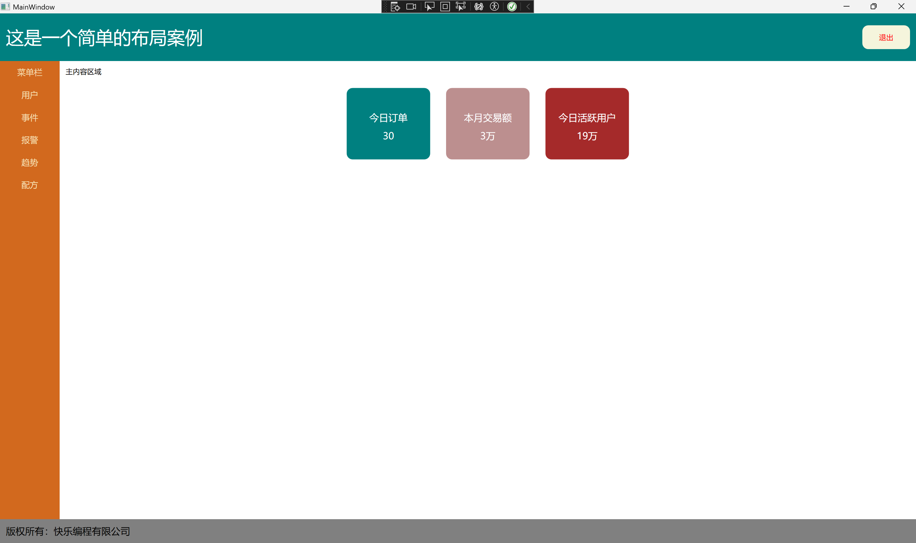
全屏效果
 hobby
hobby